
Contents
To Display a Graph of a Sensor/Transmitter's Data
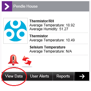
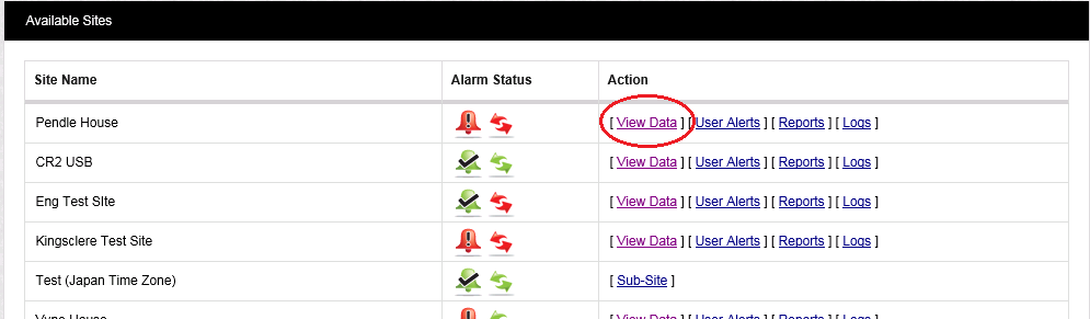
1.From the Dashboard, click on View Data.
•From either the Site's Dashboard icon:
•Or the Text View:
2.Select View Data on the left-hand side of the top menu bar. See Figure 511 below:
Figure 511
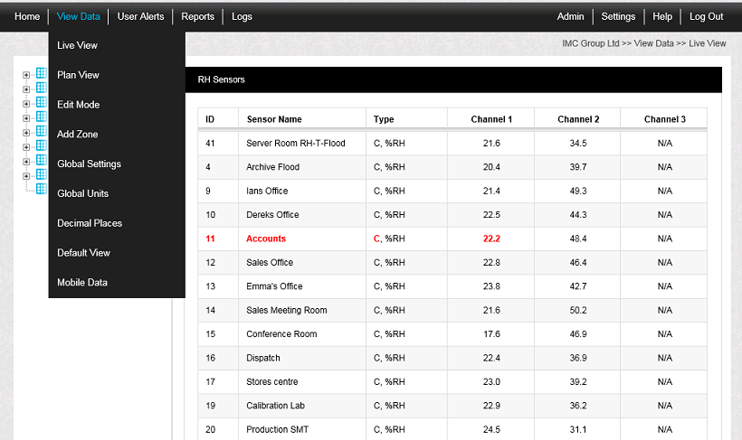
3.Click on Live View from the drop down menu to access the Live View Table showing the Sensors associated with the selected Zone. See Figure 512 below.
4.Either
Click once on the underlined Sensor/Transmitter name in the left-hand list.
Or
Double-click on the Sensor name in the Live View list (right-hand list).
•The Graph Window is displayed with the data shown as either a Line or Bar Chart (Histogram). See Figure 512 / Figure 513 below.
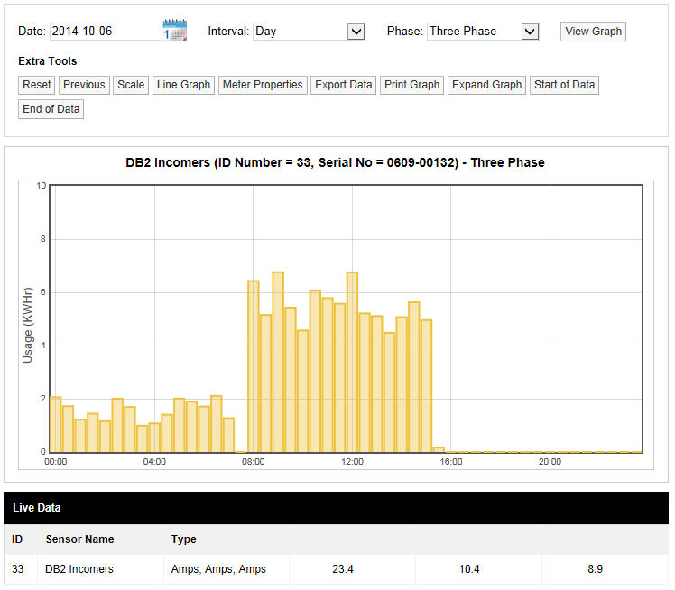
•Current and Pulse Count Sensor data are displayed as a Utilities Bar Chart. For Utilities Bar Chart specific options, see Utilities Bar Chart section.
Figure 512 - Line Graph
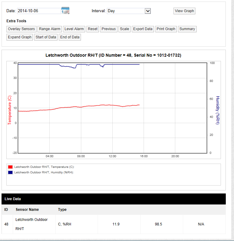
Figure 513 - Current / Pulse Counter Bar Chart
Graph Window Functionality
The following Graph Functionality, related to the graphical display of Sensor/Transmitter data, is available from the Graph window:
•Next
•Print Graph
| Note: | Whilst much of the Graph Functionality is common to both graph types, please be aware that the exact functionality available depends on the selected graph type, the interval selected and the type of sensor. |